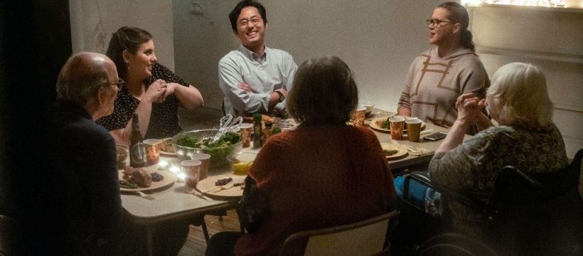
The initial meeting between “The Humans” director Stephen Karam and production designer David Gropman included some personal history. “The first thing we did was, he walked me around his neighborhood,” Gropman says.
Adapted from Karam’s play of the same name, “The Humans” is a New York-set drama dripping with anxiety and claustrophobia as it follows a family’s Thanksgiving in the youngest daughter’s newly rented apartment. Karam began writing the play in 2007, in the climate of mid-financial crisis, post-9/11 America and inspired by what he calls “the maze of prewar apartments I’ve lived in my entire New York life.”
Shortly after Gropman signed on, he knew he had a location to share as well. The apartment in the film is almost a complete replica of the home of a group of Gropman’s close friends. Spending time with them in the early design stages, he realized he was already sitting in the kind of apartment Karam was talking about.
“I’m trying to imagine, how do I create a world that’s very specific and somewhat mysterious, that doesn’t reveal itself all at once?” he says. “You have to start with reality. To make an audience believe in your story, there should be a level of familiarity that they can relate to, to feel comfortable that there’s an honesty in the telling of the story. Then let the writer and the actors take you from there.”
Because his friends’ place was real in that way, Gropman brought Karam into the apartment and asked him to imagine his characters moving through it. “The Humans” is studded with elements of near-horror — Karam has cited directors like Wes Craven as influences, resulting in a soundscape full of what Variety chief film critic Peter Debruge called demonic rumblings and bowling-ball thuds. To sell those elements, Gropman felt the believability of the space was key. Karam agreed that there was something special in the apartment and gave his production designer the green light to re-create it on a soundstage.
Since the narrative includes one sister who overanalyzes her mother’s size, another whose colon condition regularly sends her sliding into a tiny bathroom, and a grandmother who uses a wheelchair requiring constant support, it meant that the characters interact with the space around them in painstakingly specific ways, which necessitated rigorously accurate measurements when it came to building hallways and doors.
Rehearsals were required before the stage was finalized to ensure the exact level of awkwardness required for a scene where, say, the grandmother’s wheelchair needed to pivot in and out of the bathroom multiple times in order to make it down the narrow hallway.
Then came the gory details: paint splotches alluding to the ghosts of tenants past, a glass doorknob that cinematographer Lol Crawley shot through to distort the night with the characters’ anxieties.
How many of these images and how much of the mechanics were inspired by the look of the original play, which won David Zinn the Tony for best scenic design?
“I’ve done countless stage-to-film designs. And not one of them have I gotten to see in the theater,” Gropman says with a laugh.
Source: Read Full Article

