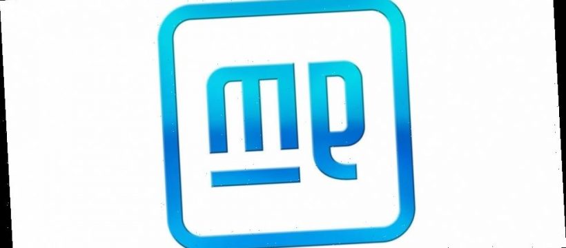
After more than half a century, General Motors has changed its company logo to usher in a new era of electric vehicles. Gone is the gradient-blue solid square with the underlined capitalized “GM,” and in its place is a square with rounded corners and lowercase “gm” with just the “m” underlined — a gradient through the logo, in a way, makes this look like an icon for an Abobe application.
GM comments: “The new GM logo features a color gradient of vibrant blue tones, evoking the clean skies of a zero-emissions future and the energy of the Ultium platform. The rounded edges and lower-case font create a more modern, inclusive feel. The underline of the “m” connects to the previous GM logos as well as visually representing the Ultium platform. And within the negative space of the “m” is a nod to the shape of an electrical plug.”
The new logo is fresh and definitely speaks of a more environmentally-friendly future for the American automotive manufacturer. We are now wondering what this means for the several automotive brands under the GM umbrella. Could we perhaps see updated badges in the coming future?
In other automotive news, General Motors to launch all-new fully-electric Hummer.
Source: Read Full Article
